New Items - Tom Sawyer and Huck Finn
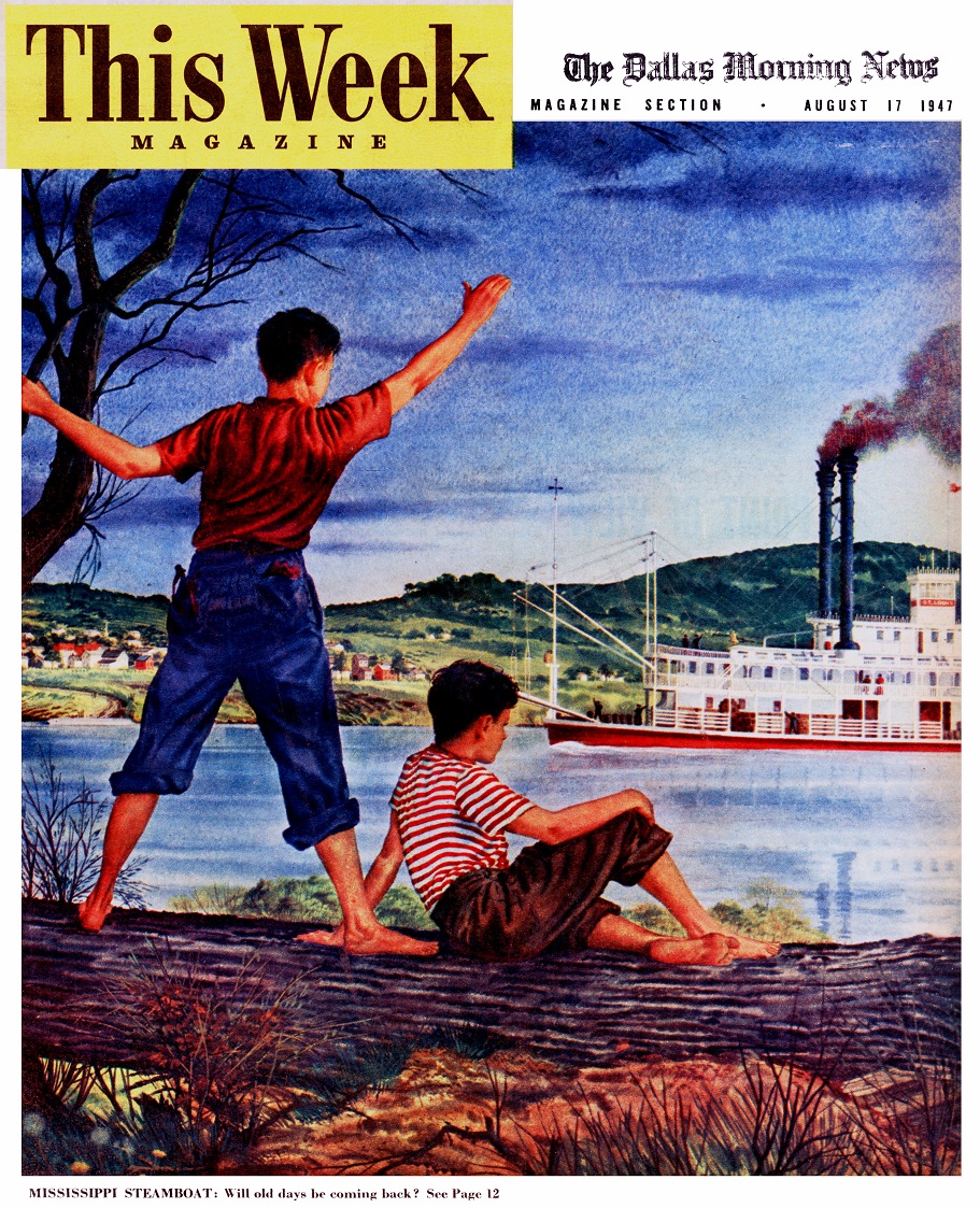
Sunday Supplement cover from 1947 with a steamboat named ST. LOUIS
This Week MAGAZINE
The Dallas Morning News
August 17, 1947
Page 12:
THIS WEEK'S COVER, by Paul Adam Wehr shows a scene that is a rare one in real life. Not many youngsters along the Mississippi are lucky enough to catch sight of a grand old river steamboat, complete with belching smoke and gingerbread trim.
Over the past century, fully 7,000 of these craft (built shallow enough to "float on dew"; plied the river. Now only one large passenger packet remains, plus a few short-excursion boats. Luckily several shipping companies are starting plans to bring the paddlewheelers back. Here's hoping they succeed, for the era of Mark Twain's Mississippi is too colorful to slip forever from the American scene.
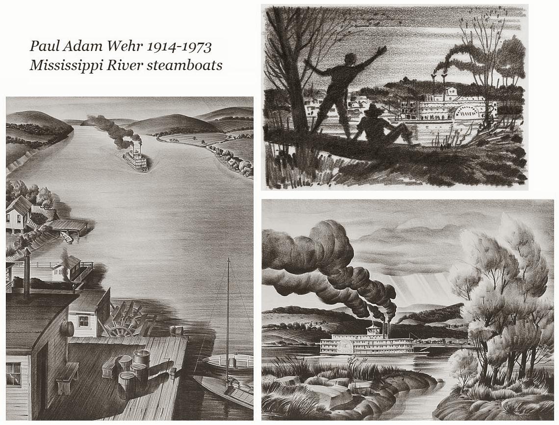
Also attached is a composite of one drawing and two lithographs of steamboats by Paul Adam Wehr.
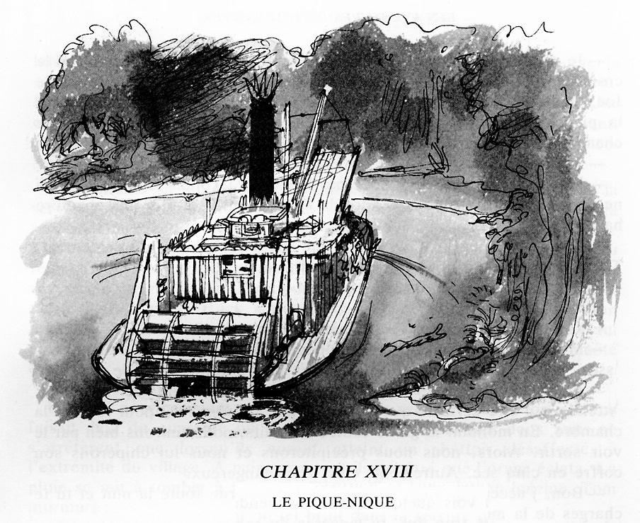
French TOM SAWYER "the old steam ferry-boat" 18th chapter heading illustration by DANIEL BILLON
Mark Twain
LES AVENTURES DE TOM SAWYER
Text Français de P.-F. PF CAILLÉ
Illustrations de DANIEL BILLON
Chapter heading XVIII (Chapter 18) with excerpt from text:
"Le vieux bac a vapeur fut affrete pour l'occasion; bientot la cohoi enfantine se repandit dans la rue principale du village; presque tout monde portait un panier a provisions sous le bras."
Original text in English by Samuel Clemens:
(The old steam ferry-boat was chartered for the occasion; presently the gay throng filed up the main street laden with provision-baskets).
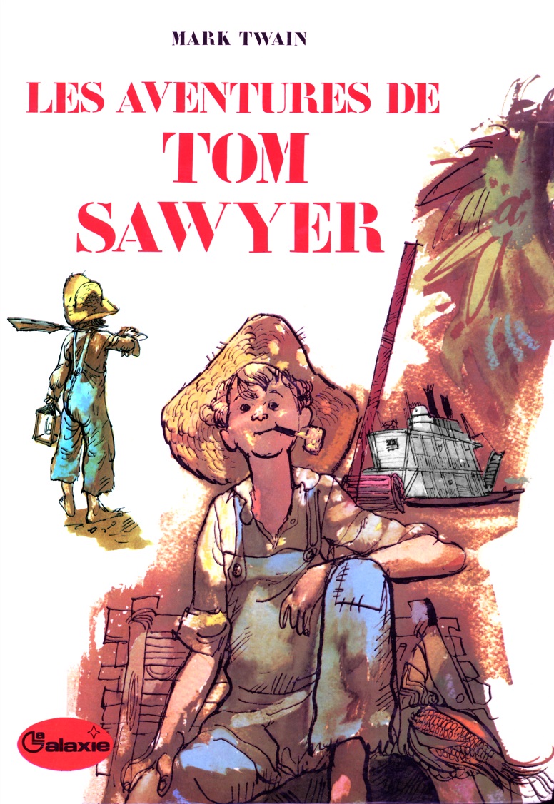
French edition Tom Sawyer Cover Art by Daniel Billon 1973
We have other Tom and Huck by Daniel Billon from 1969 & 1975
on Huck and Tom page 4. Please add this one after those two
French edition
Tom Sawyer
Cover Art by Daniel Billon 1973
Published by La Gallerie Hatchette
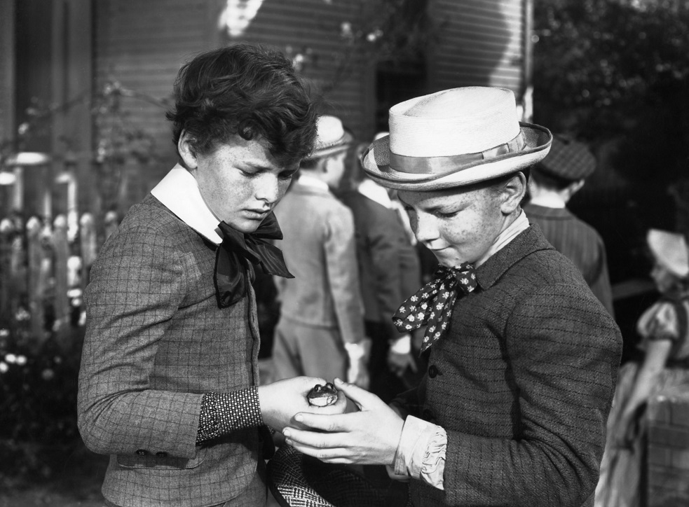
Selznick's TomSawyer: Tommy Kelly with Kelly Holt Trading in a Frog
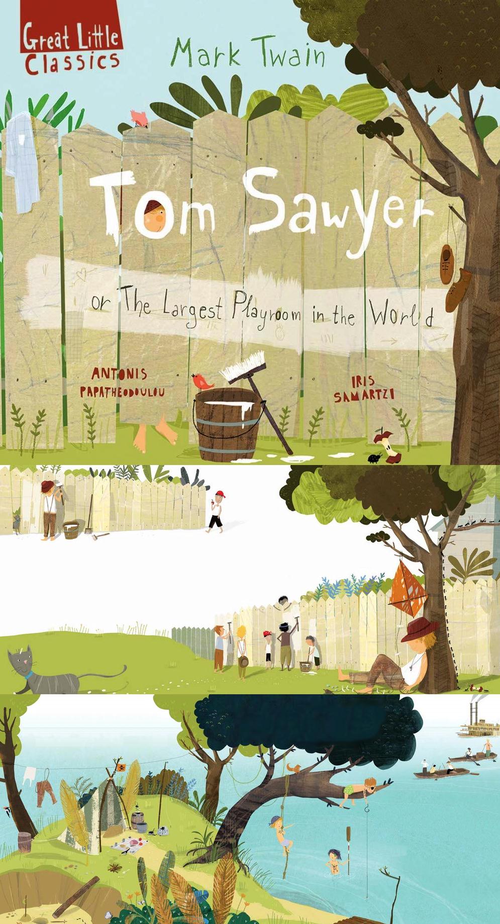
Mark Twain's Tom Sawyer: or The Largest Playroom in the World
Mark Twain's Tom Sawyer:
or The Largest Playroom in the World
Great Little Classics Series Hardcover
Faros Books (Greece) 2020
36 pages
Adapted by Antonis Papatheodoulou
Illustrated by Iris Samartzi
In a very small town on the banks of the Mississippi, with his Aunt Polly, his cousin Mary and his half-brother Sid, lives the naughtiest, wildest, unruliest . . . good boy in America: Tom Sawyer, who opens his front door and walks into the largest, most wonderful playroom: in the world!
A captivating retelling of Mark Twain's classic adventure tale uses lively, humorous text and unique mixed-media style illustrations.
Antonis Papatheodoulou was born in Athens. He has published more than 50 books for children, some of which have been translated into eleven languages and which have won many awards, including two Greek State Picture Book Awards and the 2016 International Compostela Prize. Five of his books have been included in the White Ravens list of the International Children's Library of Munich. He has been a candidate for the 2019 Astrid Lindgren Memorial Award.
Iris Samartzi is a children's book illustrator and an art teacher. Her work has received many awards, including the 2016 International Compostela Prize for Picture Books, the Greek State Picture Book Award (2012, 2016) and the Greek IBBY Award (2012, 2015, 2016 and 2017). When she is not illustrating books, she runs art workshops for children. She lives and works in Athens, Greece. She is nominated for the Hans Christian Andersen Award 2020.
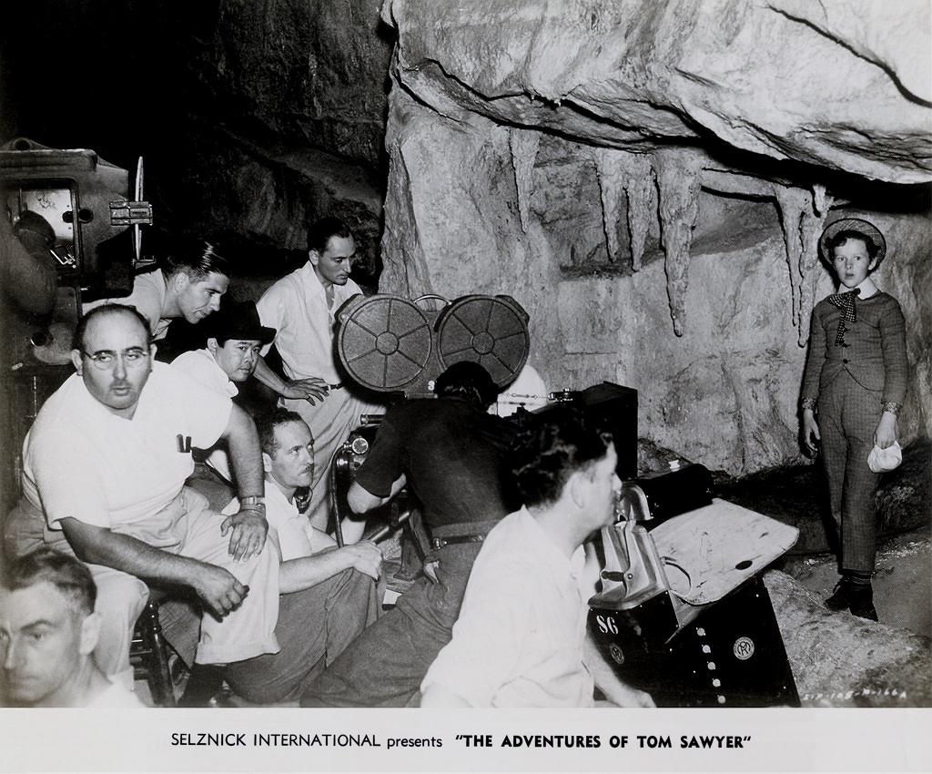
Production still filming ADVENTURES OF TOM SAWYER on the Cave set Selznick 1937
"Lost in the Cave" for David O. Selznick's 1937 production of ADVENTURES OF TOM SAWYER
Heavy set fellow in white wearing glasses is Director Norman Taurog lower left.
Director of Photography James Wong Howe wearing a black hat is among his assistants behind the Technicolor camera.
Tommy Kelly in costume as Tom Sawyer far right in the cave set on a soundstage.
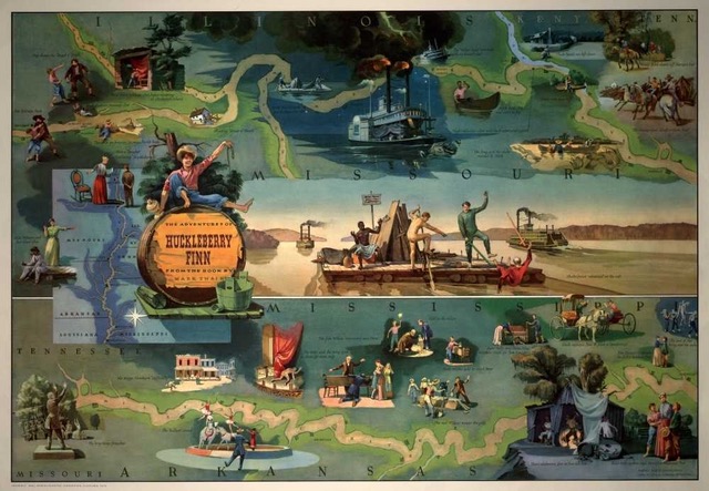
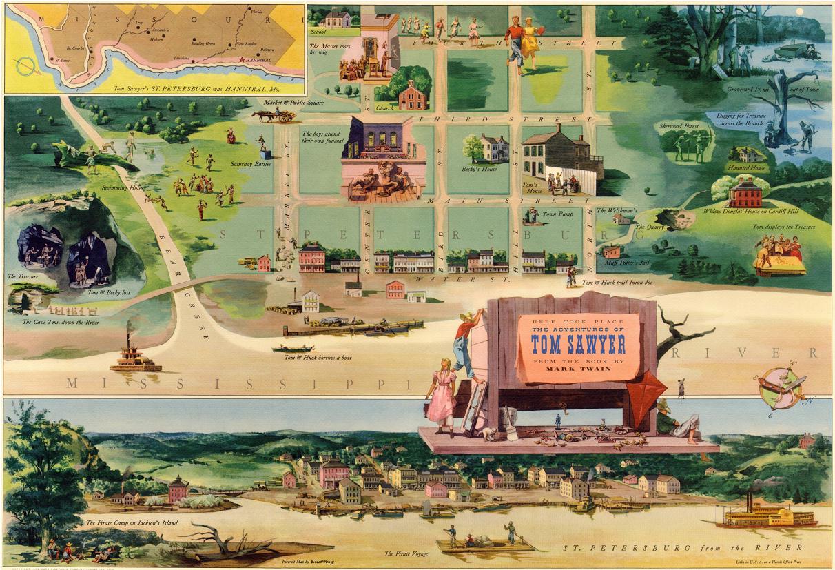
Everett Henry illustrations
Everett Henry pictorial maps of Tom Sawyer and Huckleberry in watercolors that he painted
for Harris-Seybold (Cleveland, OH) advertising calendars.
Attached is a reduction of TOM SAWYER's "St. Petersburg" that I made from scanning the print in 4 sections and assembling them in Photoshop.
Editor's note:
Many thanks to Rich Foley who brought our attention to these images. Rich wrote to us in 2020:
" The Library of Congress has a high-resolution file for Huckelberry Finn but not for Tom Sawyer. They plan to scan all 10 of the Harris calendar paintings when they are back open after COVID. As I probably mentioned, the original Huck Finn painting used to hang behind my work desk, lucky. They would make nice additions to your museum."
It turns out our historian, Dave Thomson had prints we could add to the site.
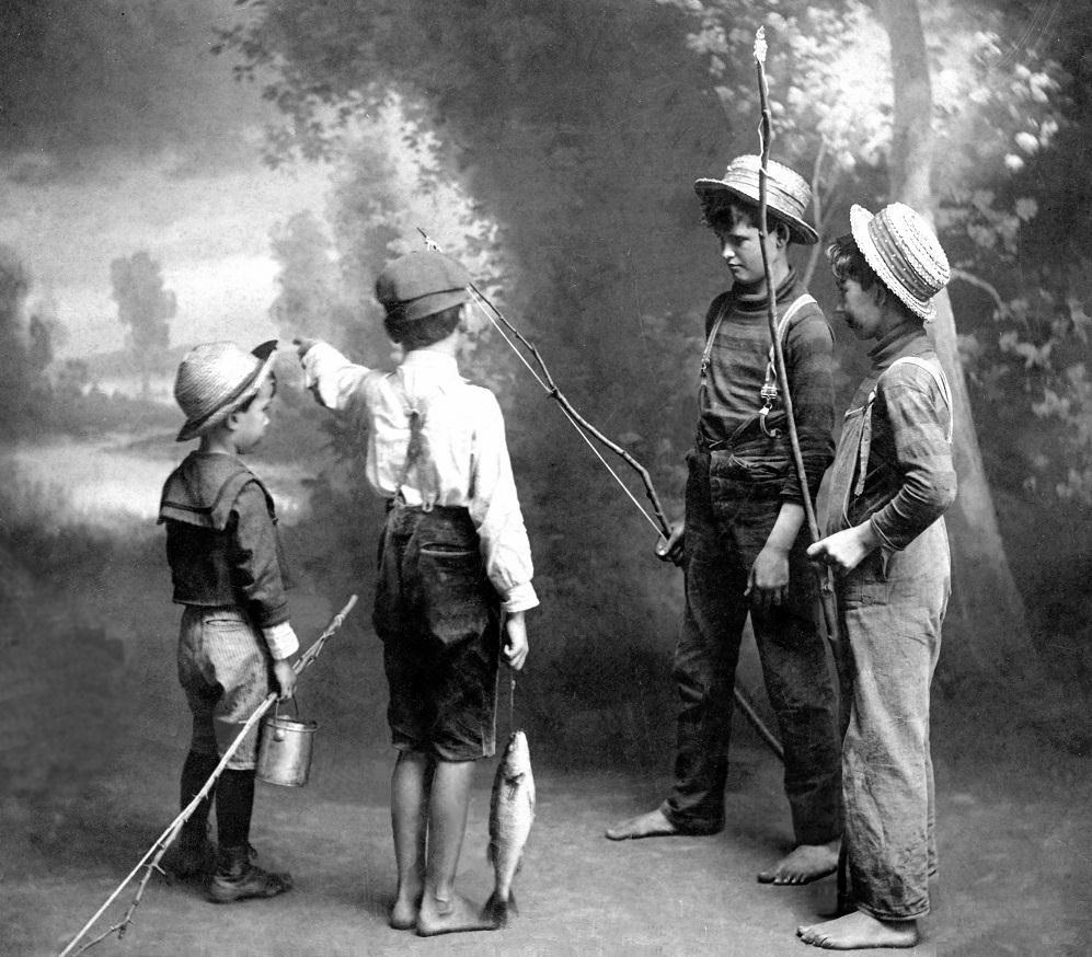
Vintage photo of four young barefoot lads with straw hats and fishing poles from an auction in Temperance, Michigan.
Three of these four young boys are barefoot, carrying fishing poles and wearing straw hats while the little feller on the left is wearing shoes and carrying a bait bucket. These pals were photographed against a studio backdrop circa approximately the 1890's. The lads are reminiscent of young Sam Clemens and his boyhood friends who fished in the Mississippi River and a quarter of a century after he left Hannibal Sam as Mark Twain would fictionalize himself and boyhood friends as Huckleberry Finn, Tom Sawyer, Tom's younger half brother Sid and Joe Harper.
This vintage photo was mounted on heavy card stock and required a lot of restoration to remove scratches, spots and other blemishes. I brightened and increased the contrast to enhance it overall.
The eBay seller got the image at an auction in Temperance, Michigan.
Would like to eventually superimpose the boys over a vintage photo of a steamboat out on the river.
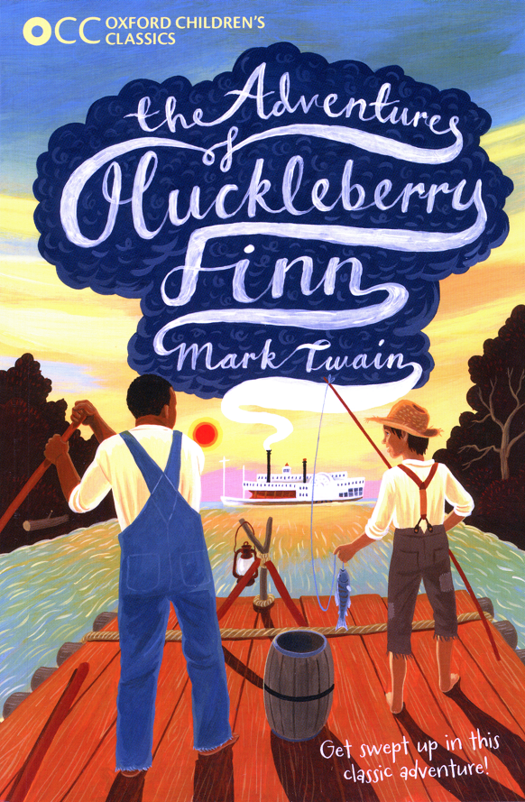
Oxford Children's Classics edition of HUCK FINN by Sam Clemens
Front cover by Illustrator David Dean
David Dean
Children's Illustrator
When I was very small I was asked, at a clinic check-up, to draw some simple shapes (a test of development and coordination) and I drew instead a Fiat 127 car. Most of my childhood was spent drawing Star Wars characters and Transformers, and for many years I wanted to draw comics. Eventually it dawned on me that someone actually paints the pictures on book covers (and gets paid for it) - what a fantastic job that must be! And so I went to university to study illustration. I graduated from Manchester Metropolitan University in 1999 with a BA (Hons) and an MA in Communication Design, and have been working as an illustrator ever since. And yes, I was right: it is a fantastic job. I work in acrylic paint, though my artwork is typically delivered as high resolution scans. I live in Cheshire, England with my two cats and hundreds of books.
Who or what made you want to become an illustrator?
Like most illustrators, I think from a very early age I loved to draw. Although I did fairly well academically at school, I didn't really like school and so drawing was a different world - contained in my head and on a piece of paper - that I could escape into. And of course, I loved comics as a kid, so for a while I wanted to be a comic book illustrator. And then when I was maybe 15 I was looking at a Star Trek novel I was reading (another fantasy world to escape into!) and it dawned on me that someone actually painted the cover, and presumably was being paid for it. That's when I really started paying attention to book jackets in particular, and illustration in general, and knew that's what I wanted to do as a career. That led to me doing a BA(Hons) in Illustration with Animation and an MA in Communication Design, both at Manchester Metropolitan University.
Share your favorite piece of artwork from your portfolio and walk us through its creation.
My favorite piece changes quite regularly but for the last year or so it has been the cover I did for Natasha Farrant's "The Children of Castle Rock", published by Faber & Faber. When I was commissioned to illustrate this one I don't think the manuscript was even finished so I was working from some descriptions of the main characters, a few pivotal scenes and the idea that the book's tone was "Enid Blyton meets St. Trinian's" (in fact, when I first received the brief, the book had a different title!). Normally I like to read the book before I start on the cover, but something about this one just spoke to me, and I ended up illustrating the book I had imagined in my mind from those bare bones. I was also asked to provide two alternative roughs/sketches. I began by doing a little research online of the highlands setting and then went straight into sketching out ideas in my sketchbook. Sometimes I'll go through many ideas before something starts to feel right, and occasionally the right idea arrives almost fully formed quite early on. This was one of those instances, and it just needed refining. As you can see, I soon got to a pencil sketch that isn't far away from the final cover. I then scanned this and carried on working on it in Photoshop. Depending on the length of the deadline for a project I like to work up my roughs in color - not only does this save time (and possible false starts!) when it comes to painting the final artwork, but it gives me the freedom to experiment and try different things (the pink in the sky is a good example - I accidentally adjusted the hue of the wrong layer, but it looked perfect). When I had the two alternative cover roughs done I submitted them to the designer at Faber, and was very quickly given the green light on my favorite of the two (the purple and yellow one) with no alterations needed.
Which project are you most proud of?
There are two recent ones that I'm proud of, though for different reasons.
The first is The Barefoot Book of Children (re-titled as Children of the World for the paperback release) which I just think is a very important and very timely book. I live in Britain which is currently being split down the middle by Brexit, and it's easy to see watching the news how the US is equally divided on many issues, and sadly (in both countries) one of those issues is race, so it seems that a book that seeks to show children that for all our differences (the foods we eat, the homes we live in, the worlds outside our windows) there are far more fundamental things that unite us and that the differences just make the world a richer and more vibrant place.
The second is the series of twenty covers I did for Egmont Books' reissue of their Michael Morpurgo backlist. To be asked to take on such a big project for such a major author (one of the covers was for 'War Horse' which is one of the best-loved children's novels of the last thirty or forty years) felt like a real validation of my work. And then to see some of the covers blown up to eight feet high and displayed in the V&A Museum of Childhood in London, with my artwork on the museum's windows, was a real thrill. Meeting Michael Morpurgo himself and hearing him praise my work was just the icing on the cake.
What was your first commission as a professional illustrator?
Haha! It was a book cover for a collection of essays - I was still a student on my MA course at the time and one of the lecturer's (a brilliant typographer) was also the art director for a small independent poetry publisher in Manchester. He asked me to do this cover for him and I think paid me the princely sum of fifty quid. It wasn't long after that when meeting agents that one (who went on to be my agent for the next 19 years) asked me if I had any published work. When I told her how much I'd been paid she said "you can keep that client"! After graduating my first commission was a horoscope illustration for Elle magazine (and that paid £250).
Have you ever thought about trying out a different technique or a different style?
I've thought about working digitally, mainly because everyone seems to these days. Most of my roughs are completed digitally, even if they start out in my sketchbook, and I do enjoy the freedom that Photoshop gives me to play around and experiment, particularly in terms of color - I think it has made my use of color much more sophisticated - but I love working in paint, and I think there is a timeless quality to work that has been created by hand on paper or canvas. I enjoy that physical connection to the finished piece.
As for style: well my style has developed over the years, as I've learned new things, as I've absorbed new influences, and sometimes as a result of being challenged by a particular brief, but I feel like it has been a gradual, organic development; there has never been that piece that I can point to as being totally different than anything that came before. And I think that is because I haven't really thought about my "style" in maybe 15 years or more. It isn't a hat I put on and can swap for a different one, though I hugely admire illustrators who do work in multiple styles, or take that risk and completely reinvent their portfolio. When I was at university and in my first few years of working professionally I used to do a lot of flat perspective that was inspired by Indian miniature painting, but it was always done very consciously. Now I feel like my style is just my natural voice, the way I see the world.
Which area of children's publishing excites you the most?
I am passionate about book covers, and I've naturally gravitated towards novels for the 8-12 years Middle Grade age range, where there's still an innocence and charm to the books; and whilst the subjects can be challenging (the death of a loved one, the horrors of war...) they're never handled in a way that is too dark, so I can use lots of lovely bright colors. There's usually a bit of adventure or mystery in those books too which lends itself to dramatic compositions and crazy perspective, things that I just love doing.
Animals feature heavily in children's books - do you have a pet?
I do - I have two cats, called Button and Ptolemy. They're brothers (littermates?) and are 11 now though they act like kittens half of the time. They frequently visit me in my studio whilst I'm working and they brighten up every day. They've also cropped up in quite a few of my illustrations!
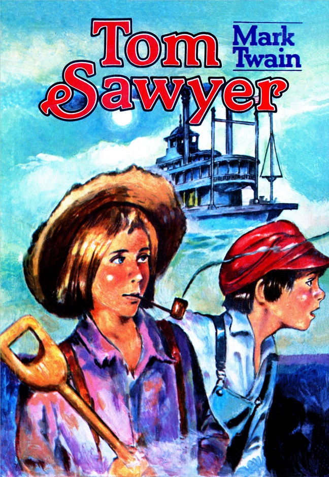
TOM SAWYER cover from book Turkish language edition published in Istanbul
Front of the dust jacket from a Turkish language edition of Mark Twain's TOM SAWYER
published in Istanbul in 1984
Turkcesi translation by Y. Yafet
Serhat A.S.
iltli Cocuk Klasikleri Dizisi : 6
Mark Twain/TOM SAWYER'IN MACERALARI
Lower left, Huck Finn wearing straw hat, smoking corncob pipe and carrying a shovel to dig for buried treasure. Tom Sawyer on the right wearing a red cap and bib overalls. The illustrator did their homework and represented the style of the steamboat accurately above the boys.

With the exception of images credited to public institutions,
everything on this page is from a private collection.
Please contact Steamboats.com for permission for commercial use.*
All captions provided by Dave Thomson, Steamboats.com primary contributor and historian.